Clean, modern, beautifully minimal
Flat design is a minimalist visual approach characterized by the absence of three-dimensional visual cues — no drop shadows, gradients, textures, or other skeuomorphic elements that simulate physical depth or material surfaces. While the term "flat design"...
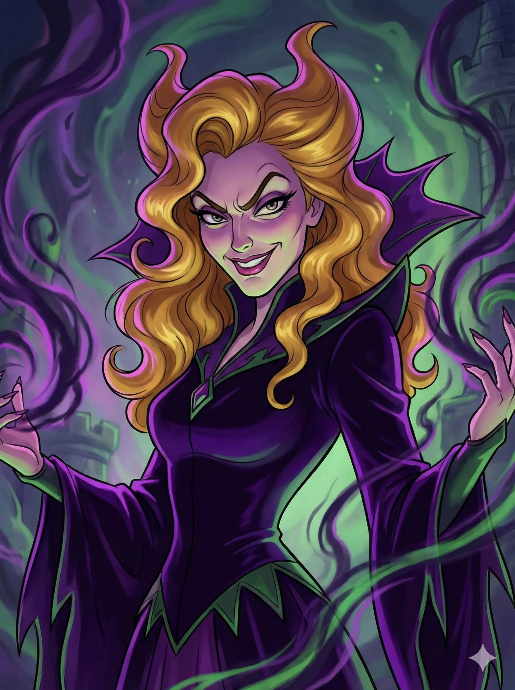
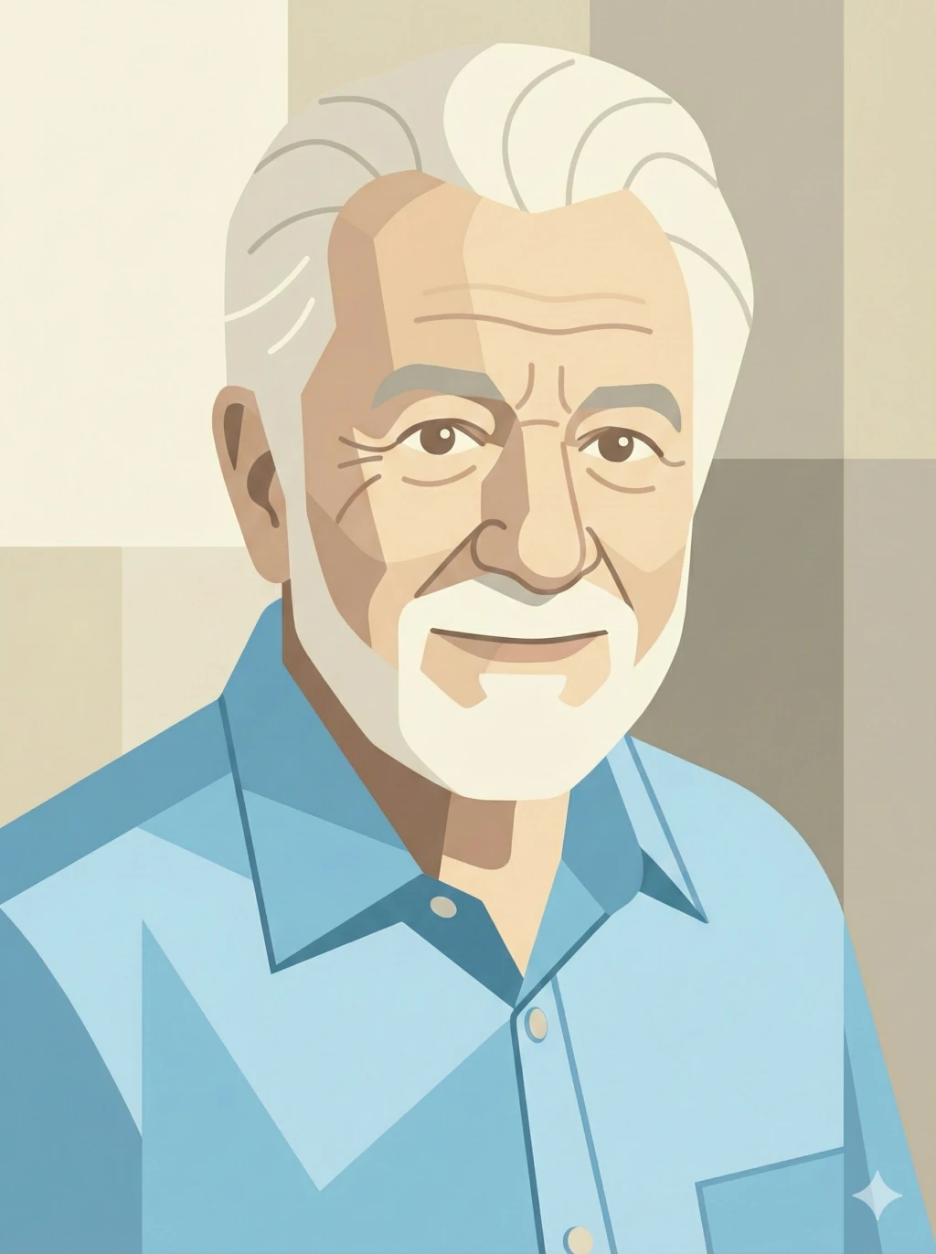
 📷 Before
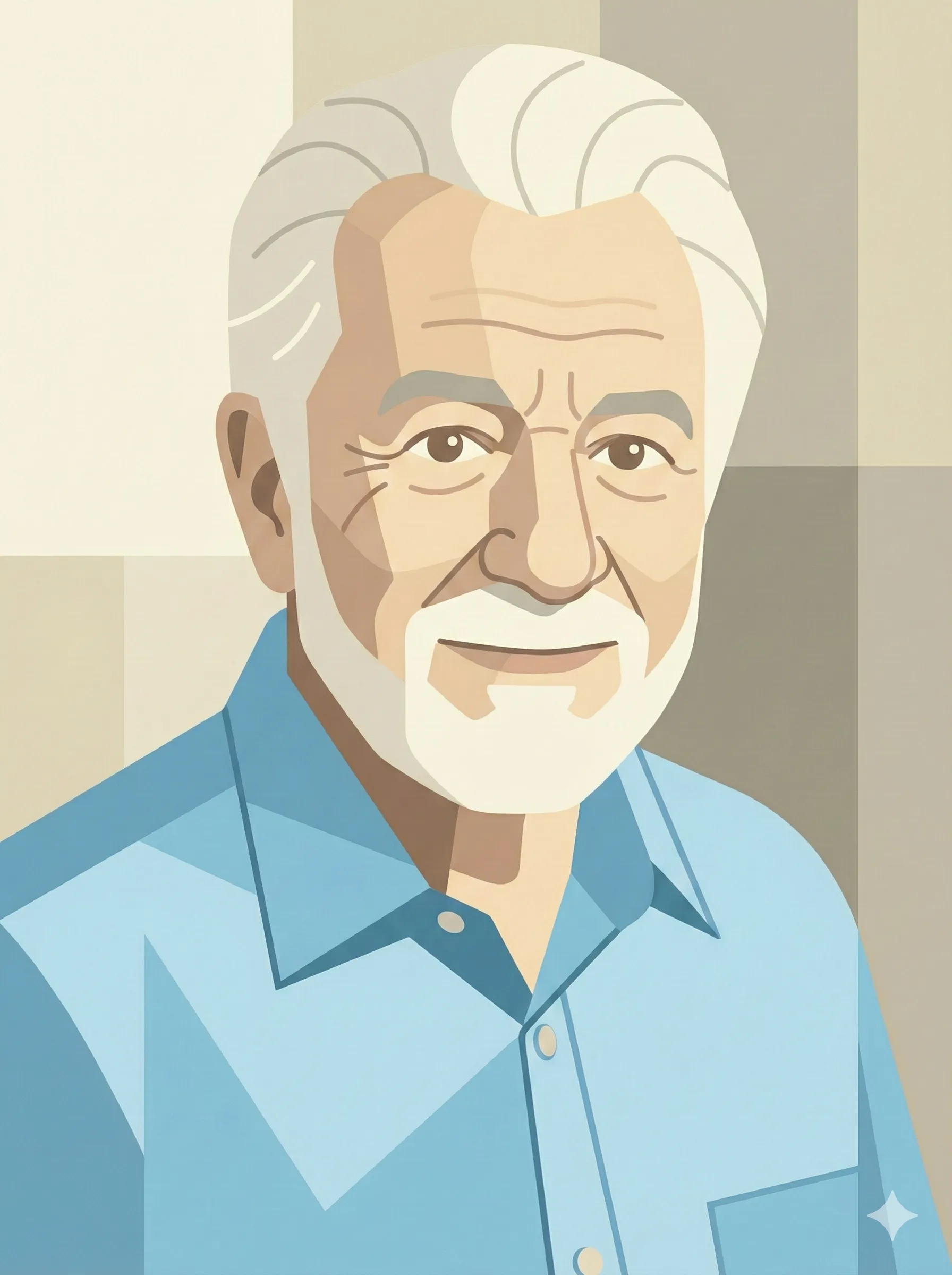 📐 After


About Flat Design
Origins, history, and what makes this art style unique
The immediate catalyst for flat design's dominance in digital interfaces was the backlash against skeuomorphism — the practice of designing digital interfaces to mimic the appearance of physical objects (leather textures for calendar apps, wood-grain backgrounds for bookshelves, metallic beveling on buttons). Apple's pre-iOS 7 interface design was the most prominent example of skeuomorphism, and when Jony Ive's team stripped away these decorative elements in 2013, it catalyzed a global shift toward flat visual language across the entire technology industry. Microsoft had actually preceded Apple with its Metro design language (2010), inspired by the clean typography and wayfinding systems of Swiss transit signage. Google's Material Design (2014) later offered a middle path, reintroducing subtle shadows and motion to create what is sometimes called "flat 2.0" or "semi-flat" design, acknowledging that some depth cues aid usability without abandoning flat design's essential clarity.
As a portrait and illustration style, flat design translates these interface principles into character depiction: figures are rendered with clean vector shapes, uniform color fills without gradients, and minimal detail that communicates identity through bold simplification rather than realistic rendering. The aesthetic connects to a long tradition of poster art — from the lithographic work of Toulouse-Lautrec and Jules Chéret in 1890s Paris through the propaganda posters of the early Soviet avant-garde to the mid-century modernism of Paul Rand and Saul Bass. In each era, the imperative to communicate quickly and boldly at scale led designers toward the same visual principles: flat color, strong silhouettes, typographic integration, and the elimination of non-essential detail.
Key Elements
The core artistic techniques that define Flat Design
Geometric Reduction & Vector Precision
Flat design portrait illustration reduces human forms to their essential geometric components — circles, ellipses, rectangles, and carefully crafted Bézier curves. This approach descends from the Constructivist and Bauhaus traditions of geometric abstraction, where complex natural forms were analyzed and rebuilt from basic geometric primitives. The use of vector graphics (mathematically defined shapes rather than pixel grids) ensures clean edges at any scale and reinforces the style's association with precision, modernity, and technological sophistication.
Uniform Color Fills & Systematic Palette Design
The defining characteristic of flat design is the use of uniform, uninflected color fills — no gradients, no textures, no simulated lighting. Each shape is filled with a single, consistent color value, and tonal variation is achieved through the juxtaposition of discrete color shapes rather than continuous shading. Palettes are systematically designed, often using a primary set of 4-6 colors with calculated relationships (complementary, split-complementary, or analogous) plus neutrals, reflecting the color theory systematization practiced by Josef Albers and the Swiss Style designers.
Negative Space & Compositional Economy
Flat design inherits the Swiss Style's reverence for negative space (white space) as an active compositional element rather than empty background. In flat portrait illustration, the areas left empty or filled with background color are as carefully considered as the filled shapes — they define form, create breathing room, and direct visual attention. This economy of means, where every element must earn its presence, produces images with a clarity and directness that cut through the visual noise of information-dense digital environments.
How It Works
Transform your photo into flat design art in 3 simple steps
Upload Your Photo
Choose any portrait photo from your device. Front-facing works best for stunning results.
Select Flat Design
Our AI analyzes your photo and applies the flat design artistic style with precise attention to detail.
Download & Share
Get your high-quality cartoon portrait instantly. Download in full resolution or share directly.
Perfect For
Before & After
See the Flat Design transformation in action
Flat Design FAQ
Flat design's genealogy traces through several major 20th-century design movements. The Bauhaus school (1919-1933) established the philosophical principle that form should serve function without superfluous decoration. The De Stijl movement, led by Piet Mondrian and Theo van Doesburg, demonstrated that complex visual experiences could be built from primary colors and geometric shapes. The Swiss International Typographic Style of the 1950s-60s codified the grid-based layout, sans-serif typography, and reductive visual language that flat design directly inherits. Mid-century poster designers like Saul Bass and Paul Rand proved these principles could create powerful, emotionally resonant commercial art. Flat digital design synthesizes all these traditions for the screen-based era.
While flat design and minimalism share a reductive impulse, they are distinct concepts. Minimalism, as an art movement originating in the 1960s with artists like Donald Judd and Dan Flavin, seeks to reduce art to its essential material and formal properties — it is primarily concerned with purity and the elimination of representation. Flat design, by contrast, is a representational style that simplifies depiction rather than eliminating it. A flat design portrait still clearly represents a person; it simply does so using uniform color fills and geometric shapes rather than realistic rendering. Flat design is minimalist in technique but not necessarily in content or communicative intent.
Flat design's rise was driven by both practical and aesthetic factors. Practically, flat interfaces load faster, scale cleanly across diverse screen sizes (from smartwatches to billboards), and are easier to maintain in design systems. Aesthetically, flat design represented a collective fatigue with skeuomorphism — the practice of mimicking physical textures and materials in digital interfaces — that had dominated the smartphone era's first years. Microsoft's Metro language (2010), Apple's iOS 7 (2013), and Google's Material Design (2014) each adopted flat or near-flat principles, establishing it as the default visual language of the technology industry and, by extension, of contemporary visual culture broadly.
Try Flat Design
Style Now!📐
Upload your photo and get your flat design portrait in seconds. Free to start!